At Artix Creative, we understand that a brand’s colors are more than just design choices. They are strategic tools that speak volumes about your values, industry, and target audience. So, if you're asking how to pick the right colors for your brand, you’ve come to the right place. These brands use color as a communication tool. That’s why picking the right colors isn’t just an artistic decision—it’s a strategic move that reflects your mission, values, and customer experience.
 Your logo is often the first thing people see—so your logo colors need to speak volumes instantly.
 Red evokes appetite and urgency, while yellow signals cheer and positivity—perfect for fast food.
 Represents energy, freshness, and growth—ideal for a platform that’s all about discovery.
 Reflects simplicity, sophistication, and modern elegance. A minimalist’s dream.These aren’t random choices—they’re intentional, psychology-backed branding decisions.
What is Color Psychology in Branding?
Color psychology refers to the study of how colors affect human emotions and behavior. In branding, color psychology helps shape the way consumers perceive a company, product, or service.When done right, your brand colors can:- Enhance brand recognition (up to 80%!)
- Trigger emotional responses
- Influence buying decisions
- Set the tone for your entire brand identity
Why Are Brand Colors Important?
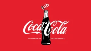
Think about some of the world’s most iconic brands:- Coca-Cola is bold and energetic with red.

- Facebook feels trustworthy and calm with blue.

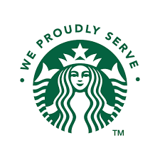
- Starbucks leans into green for growth and freshness.

 These brands use color as a communication tool. That’s why picking the right colors isn’t just an artistic decision—it’s a strategic move that reflects your mission, values, and customer experience.
The Emotional Meaning of Colors
Here’s a breakdown of common brand colors and the psychological messages they send:| Color | Emotion/Meaning | Industries |
| Red | Energy, passion, urgency | Food, retail, entertainment |
| Blue | Trust, security, calm | Finance, tech, healthcare |
| Green | Growth, health, nature | Wellness, sustainability, finance |
| Yellow | Optimism, warmth, cheer | Children’s products, retail, tech |
| Orange | Confidence, friendliness | Hospitality, fitness, startups |
| Purple | Creativity, luxury, wisdom | Beauty, education, premium goods |
| Black | Sophistication, power | Fashion, luxury, tech |
| White | Simplicity, cleanliness | Health, minimal brands, tech |
| Pink | Compassion, femininity | Beauty, fashion, wellness |
| Gray | Neutrality, professionalism | Legal, tech, B2B services |
How to Pick the Right Colors for Your Brand
Choosing your brand’s colors involves more than picking your favorite shade. It’s a process that should align with your brand identity, audience, and industry. Here’s how to do it right:1. Define Your Brand Personality
Start by asking: What does my brand stand for?Are you bold and adventurous, or calm and professional? Your brand personality should guide your color palette.- Energetic & bold: Try red, orange, or yellow.
- Trustworthy & professional: Blue and gray work well.
- Creative & luxurious: Purple or black may be best.
2. Know Your Audience
Different colors appeal to different demographics. For example:- Teens might respond well to bright, bold tones.
- A corporate audience might prefer conservative, muted palettes.
3. Analyze Your Competitors
What colors dominate your industry? Use that insight to:- Blend in (for familiarity)
- Or stand out (for disruption)
4. Choose a Primary and Secondary Palette
Don’t overload your brand with too many colors. Stick to:- 1–2 primary colors: The main brand identity
- 2–3 secondary colors: For accents, variety, and flexibility
5. Test for Accessibility
Make sure your color choices work for everyone, including people with color blindness. Test for:- High contrast for readability
- Clear differentiation between tones
- Versatility on light/dark backgrounds
Logo Color Psychology: A Quick Insight
- Monochrome logos (black/white) project minimalism and versatility.
- Multi-color logos (like Google) express diversity and fun.
- Gradient logos (Instagram) show creativity and modernism.
Real-World Examples of Color Psychology in Action
1. McDonald's – Red & Yellow
 Red evokes appetite and urgency, while yellow signals cheer and positivity—perfect for fast food.
2. Spotify – Green
 Represents energy, freshness, and growth—ideal for a platform that’s all about discovery.
3. Apple – White, Black, Silver
Color Consistency Across Platforms
Your color choices should stay consistent across:- Website
- Social media
- Packaging
- Email marketing
- Print materials
How Artix Creative Helps You Choose the Right Brand Colors
We believe color is the foundation of your visual identity. That’s why at Artix Creative, we offer expert branding packages that include:- Brand discovery sessions
- Strategic color palette selection
- Logo and visual identity design
- Brand guidelines for consistent use
- Website and packaging mockups

